Television transformed weather communication by introducing something radio never could: visual context. Meteorologists stood beside hand-drawn maps and magnetic weather icons, illustrating storm systems and cold fronts so viewers could see the forecast for the first time — not just hear it described. Those early tools were simple yet transformative, changing how audiences understood the weather and its potential impact.
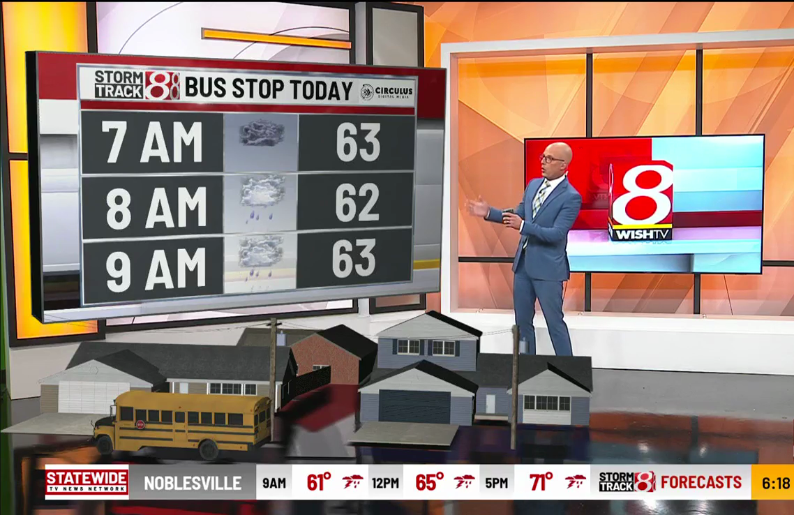
The tools have evolved dramatically since those early broadcasts, but the mission remains the same: turning complex atmospheric data into clear, actionable information. Today’s meteorologists rely on advanced visualization platforms, real-time radar, and high-resolution data to translate the science of weather into graphics that audiences can understand instantly — whether they’re watching on television, a mobile device, or a streaming platform.
The Technology Behind Modern Weather Visualization
The quality of weather communication has always depended on the tools behind the forecast. For more than three decades, Baron has worked alongside meteorologists to develop the technology that transforms raw atmospheric data into the visuals audiences see and understand on screen.
Modern platforms like Baron Lynx bring together radar, forecast models, real-time data feeds, and cameras to create dynamic graphics that can be delivered across television broadcasts, digital platforms, and streaming environments. These tools allow meteorologists to move seamlessly from analyzing complex weather data to presenting it through visuals that viewers can quickly interpret.
As forecasting technology has advanced, so have the ways meteorologists visualize the atmosphere. Today’s systems support immersive graphics, augmented reality environments, automated forecast production, and exclusive datasets covering hazards from severe storms and wildfires to winter weather and smoke.
Weather Visualization Beyond Broadcast
While broadcast meteorology shaped the early evolution of weather visualization, today the same types of weather intelligence support organizations making operational decisions every day. Emergency managers, government agencies, utilities, and enterprise teams all rely on clear visual weather data to understand developing conditions and respond quickly when risks emerge.
Solutions such as ArcGIS Weather Layers and Weather Logic bring real-time weather intelligence directly into operational platforms, allowing organizations to visualize weather alongside their assets and critical infrastructure in a single operational view.
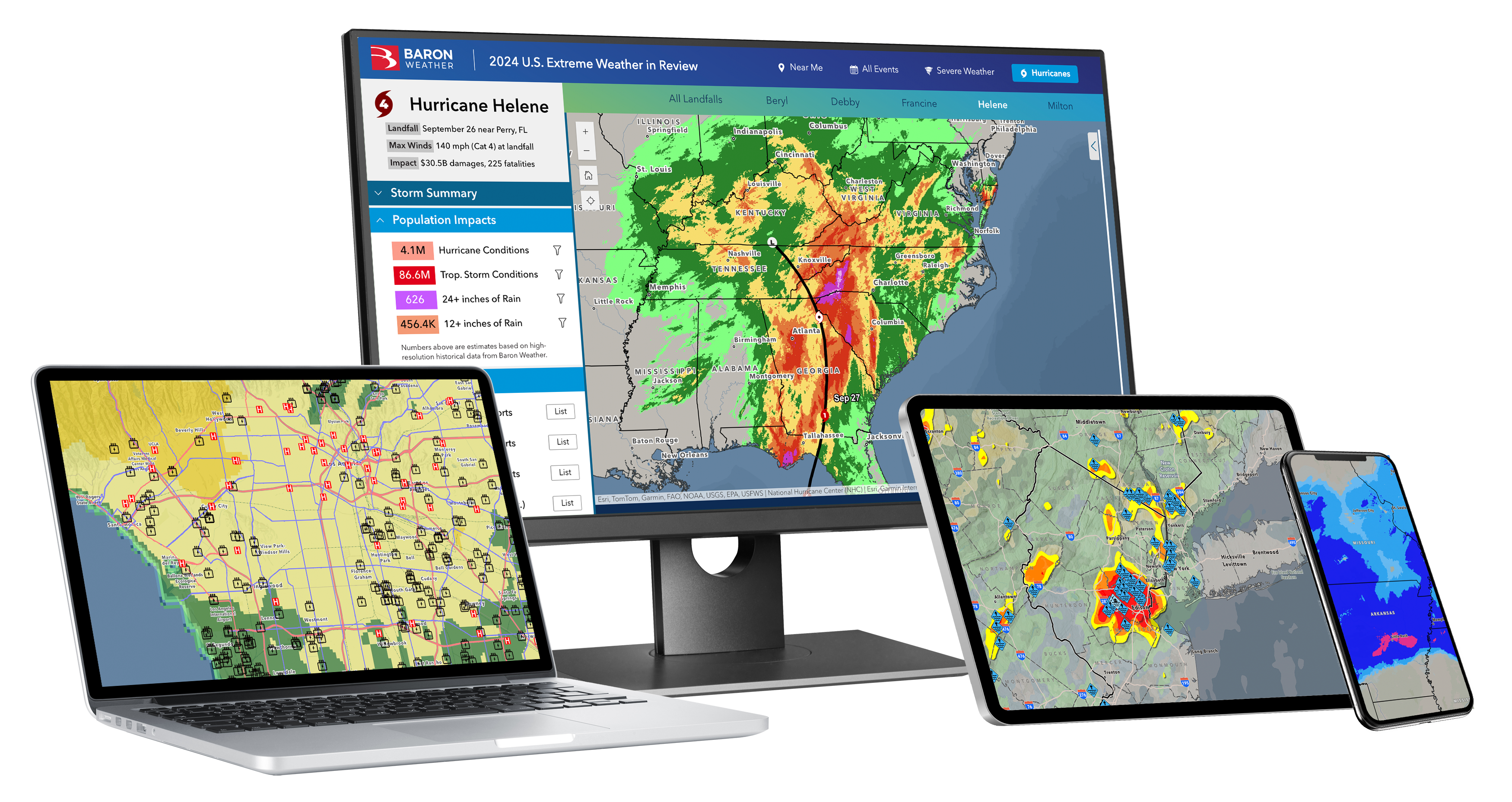
Emergency managers can overlay forecasts with evacuation routes or flood-prone areas to identify where communities may be most vulnerable. Utilities can track incoming storms against power infrastructure to anticipate outages and position crews ahead of severe weather.
These insights help organizations move from simply monitoring weather to preparing for its potential impacts — giving decision-makers clearer situational awareness when tracking severe storms, flooding, wildfire smoke, or winter weather. See why the Emergency Management Coordinator for the City of Galveston, Texas, calls Baron Threat Net a tool they won’t go without.
Visualizing Weather for Real-World Impact
Weather visualization is about impact. Think about the difference between hearing a meteorologist describe a severe storm and actually seeing it unfold — the shelf cloud rolling in, lightning striking, hail falling, wind whipping debris through the air. In that moment, the potential impact becomes immediately clear.
Visualization connects the science of forecasting with the decisions that follow — whether warning communities of approaching severe weather, staging utility crews ahead of a storm, or helping emergency managers determine where resources may be needed most.
Modern tools make that connection possible. High-resolution radar reveals storm structure and movement in real time, while forecast graphics illustrate how conditions may evolve. Advanced datasets such as the Baron Extreme Weather Index, Baron Tornado Index, Flash Flood Risk, and Storm Intel go even further by translating atmospheric signals into visual indicators of real-world risk.


When weather data is visualized clearly, it becomes more than information — it becomes real-world impact. Meteorologists and decision-makers alike can see not just what the weather is doing, but what it means for the people and communities in its path.
That is where visualization becomes truly powerful: transforming atmospheric science into actionable insight that helps people prepare, respond, and stay safe.
The Future of Weather Visualization
Visualization technology will continue evolving alongside forecasting science and the platforms used to deliver weather information. But even as new tools emerge, the core goal remains unchanged: transforming complex atmospheric data into information people can quickly understand and act on.
From daily forecasts to life-saving severe weather coverage, the ability to move seamlessly from the studio to the screen — across television, digital platforms, and streaming environments — will remain essential to delivering forecasts that truly make an impact. As artificial intelligence continues to advance, it will further enhance how meteorologists process data, generate visuals, and communicate weather more efficiently — allowing them to focus on delivering clear, impactful forecasts when it matters most.
As the next generation of weather technology takes shape, it’s often helpful to look back at the innovations that brought us here. For a broader look at how weather communication has evolved from early broadcast media to today’s digital and broadband platforms, explore our article The Evolution of Weather Communication: From Broadcast to Broadband.
